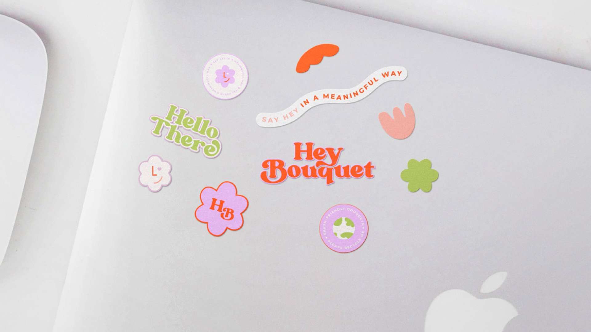
Hey Bouquet should strongly reference retro 60’s/70’s typography, but also feel modern by pairing it with abstract shapes and icons, with bright happy colours. On top of this, we needed to make sure that the branding felt joyful and fun, reflecting the brand’s mission to raise awareness in the mental health space. We wanted to make this branding feel like a joy to look at, something you’d be happy to receive in the mail. As well as this, we have made it so the logo is very adaptable and recognisable for seasonal campaigns.
SCOPE OF WORK
Brand Identity, Print & Digital Marketing Collateral, Social Media Design.
INDUSTRY
Retail, E-Commerce
LOCATION
Australia

“Hayley is so easy to work with.”
“We chose Hayley to help us create some additional brands and packaging designs. It was a super easy and enjoyable process all the way through (even when we got a little picky!). Hayley sought to understand our business and how the visual aspects of our packaging should match that vision. We're very happy with the results and can highly recommend BobbyMac Design Studio.”
Rob Lambert, Founder


